Welcome to the vibrant world of XRP, where numbers tell stories, and charts are the storytellers. As a savvy crypto investor or an enthusiastic trader, have you ever gazed at an XRP chart and felt like you were deciphering an ancient manuscript? Fear not, for you’re about to embark on a journey through the visual realms of XRP charts, explained with precision and flair. Here at XRPAuthority.com, we know that understanding these charts isn’t just about lines and candles; it’s about unlocking the secrets of the crypto universe. Whether you’re a seasoned trader or a curious newbie, this guide will transform how you perceive XRP charts.
Why are XRP charts so crucial, you ask? Well, they are the pulse of the XRP ecosystem, reflecting the dynamic interplay of market forces. Charts are like the GPS for traders navigating the tumultuous seas of cryptocurrency. They tell you where XRP has been, where it’s headed, and the potential obstacles along the way. But don’t worry; you won’t need a PhD in rocket science to understand them. With the right guide (hint: that’s us!), you’ll be reading these charts like a pro in no time.
Let’s face it; the crypto world can be a wild ride, and XRP is no exception. As one of the top digital assets aiming to revolutionize cross-border payments, it’s important to comprehend its price movements and trends. Ripple charts are more than just pretty visuals; they’re a window into XRP’s role in blockchain, finance, and trading. They bridge the gap between complex data and actionable insights, helping investors make informed decisions.
Ever wondered what those colorful candlesticks mean? Or why there are so many lines crisscrossing the chart? Think of them as the heartbeat of XRP, each flicker a sign of market sentiment. Candlesticks, trend lines, and volume indicators are your toolkit, and we’re here to help you wield them with confidence. With a sprinkle of humor and a dash of technical insight, we’ll break down these components, turning mystery into mastery.
Of course, it’s not all about the numbers and the lines. It’s about the story they tell. Each XRP graph is a snapshot of investor confidence, market speculation, and the broader economic landscape. It’s like reading a thriller novel, where each twist and turn keeps you on the edge of your seat. With XRP’s ever-evolving narrative, staying informed is key to capitalizing on opportunities and avoiding pitfalls.
In the fast-paced world of crypto trading, timing is everything. XRP price visuals provide the foresight you need to strategize your trades. Whether you’re day trading or holding for the long haul, understanding these visuals can be the difference between a profitable venture and a missed opportunity. So, why leave it to chance when you can equip yourself with the knowledge to succeed?
As we delve deeper, you’ll discover that XRP data visualization is both an art and a science. It combines the precision of quantitative analysis with the intuition of qualitative insights. Our comprehensive XRP chart guide will illuminate the path, helping you navigate the intricate patterns and signals that drive market behavior. Whether it’s spotting a bullish trend or bracing for a bearish reversal, you’ll be ready to act decisively.
At XRPAuthority.com, we pride ourselves on being the go-to source for XRP insights. We blend expertise with enthusiasm, bringing you the latest in XRP analysis with a touch of humor. Whether you’re here to sharpen your trading skills or simply to satisfy your crypto curiosity, you’ve come to the right place. So, buckle up and get ready to see XRP charts in a whole new light—because with knowledge, comes power, and with power, comes profit (and perhaps a little fun along the way).
📌 Understanding XRP Charts Explained and Its Impact on XRP
Understanding XRP price trends
Understanding XRP Price Trends
When diving into XRP charts, one of the first things every investor wants to grasp is how price trends develop over time. Price movement in the XRP market, like any other cryptocurrency, is influenced by a mix of fundamental factors, market sentiment, and technical indicators. Understanding these trends can help traders and investors make informed decisions rather than relying on speculation or hype.
At its core, XRP price trends reflect the balance between supply and demand. However, they are also shaped by external influences such as regulatory news, partnerships, and technological developments within the Ripple ecosystem. Unlike traditional assets, XRP’s price can be highly volatile, making it essential to recognize key patterns that indicate potential movements.
Historical Price Movements
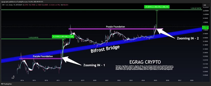
To understand where XRP is headed, it’s crucial to look at where it has been. XRP has experienced significant price fluctuations since its inception, with notable bull runs and corrections. For example:
- 2017 Bull Run: XRP surged from fractions of a cent to over , fueled by excitement surrounding Ripple’s banking partnerships and the broader crypto market boom.
- 2018-2020 Bear Market: Following the peak, XRP, like most cryptocurrencies, faced a prolonged decline, trading mostly below .
- 2021 Resurgence: XRP saw renewed interest as the market rebounded, despite ongoing regulatory challenges with the SEC lawsuit.
- Recent Trends: XRP’s price has remained relatively stable compared to other altcoins, largely due to its established role in cross-border payments and institutional adoption.
By studying these historical price movements, investors can identify recurring patterns and potential signals for future price action.
Types of XRP Price Trends
Price trends in XRP charts generally fall into three categories:
- Uptrend: A series of higher highs and higher lows, indicating strong buying momentum.
- Downtrend: A pattern of lower highs and lower lows, showing that selling pressure is dominant.
- Sideways (Range-Bound) Trend: When XRP consolidates within a specific range, neither breaking out nor breaking down, often signaling market indecision.
Recognizing these trends early allows traders to position themselves strategically, whether by entering long positions in an uptrend or shorting during a downtrend.
Factors Influencing XRP Price Trends
Several factors contribute to the development of XRP price trends, including:
- Market Sentiment: Positive news, such as regulatory clarity or major partnerships, can drive XRP’s price higher, while uncertainty can lead to sell-offs.
- Adoption and Utility: The more financial institutions and payment providers integrate Ripple’s technology, the greater the demand for XRP.
- Regulatory Developments: XRP’s legal status has been a key driver of its price action, with SEC-related news often causing sharp movements.
- Bitcoin’s Influence: Like most altcoins, XRP tends to follow Bitcoin’s broader market trends, though its unique use case sometimes leads to independent price movements.
By staying informed about these factors and regularly analyzing XRP graphs, investors can better anticipate price movements and adjust their strategies accordingly.
How to Spot Trend Reversals
One of the most valuable skills in XRP data visualization is identifying when a trend is about to reverse. Some key signals include:
- Breakout from a Range: If XRP has been trading in a tight range and suddenly breaks above resistance or below support, a new trend may be forming.
- Volume Confirmation: A trend reversal is more reliable when accompanied by a significant increase in trading volume.
- Momentum Indicators: Tools like the Relative Strength Index (RSI) or Moving Average Convergence Divergence (MACD) can help confirm whether a trend is losing strength.
Understanding these signals helps traders avoid chasing trends too late and instead position themselves for maximum gains.
By mastering XRP price trends and utilizing XRP chart guides, investors can enhance their decision-making process and navigate the market with confidence. The next step is to dive into the key indicators that traders use to analyze XRP charts effectively.
Key indicators in XRP charts
Key Indicators in XRP Charts
When analyzing XRP charts, understanding key indicators can make the difference between a well-informed trade and a costly mistake. These indicators help traders identify potential price movements, market trends, and entry or exit points with greater accuracy. Whether you’re a seasoned investor or just beginning your journey into XRP data visualization, mastering these tools is essential for making smarter trading decisions.
Moving Averages: Identifying Trends with Precision
One of the most widely used indicators in XRP charts is the moving average. Moving averages smooth out price fluctuations and highlight the overall trend direction. There are two primary types:
- Simple Moving Average (SMA): This calculates the average price over a set period. For example, a 50-day SMA shows the average closing price over the last 50 days, helping traders see long-term trends.
- Exponential Moving Average (EMA): Unlike the SMA, the EMA gives more weight to recent price data, making it more responsive to price changes. The 20-day and 50-day EMAs are commonly used for short-term trend analysis.
Traders often look for “golden crosses” (when a short-term moving average crosses above a long-term moving average) as bullish signals, and “death crosses” (when the short-term moving average crosses below the long-term moving average) as bearish indicators.
Relative Strength Index (RSI): Measuring Momentum
The RSI is a momentum indicator that helps traders determine whether XRP is overbought or oversold. It ranges from 0 to 100:
- Above 70: XRP may be overbought, signaling a potential price correction.
- Below 30: XRP could be oversold, suggesting a possible price rebound.
By monitoring RSI levels, traders can gauge the strength of a trend and anticipate potential reversals before they happen.
MACD: Spotting Trend Reversals Early
The Moving Average Convergence Divergence (MACD) is a powerful tool in XRP price visual analysis. It consists of two lines—the MACD line and the signal line—as well as a histogram that represents the difference between the two.
- When the MACD line crosses above the signal line: This is a bullish signal, indicating potential upward momentum.
- When the MACD line crosses below the signal line: This is a bearish signal, suggesting downward momentum.
MACD is particularly useful for identifying trend reversals and confirming the strength of a price movement.
Bollinger Bands: Understanding Volatility
Bollinger Bands help traders assess market volatility by plotting two standard deviations above and below a moving average. The width of the bands expands and contracts based on price volatility:
- When the bands widen: Increased volatility often precedes a breakout in either direction.
- When the bands contract: A period of low volatility often signals an impending significant price move.
Traders use Bollinger Bands to spot potential breakout opportunities and determine optimal entry or exit points.
Volume: The Ultimate Confirmation Tool
Volume is a fundamental indicator that confirms price movements. A price increase accompanied by high trading volume suggests strong buying interest, while a price drop with high volume indicates strong selling pressure. Conversely, if a price movement occurs on low volume, it may lack conviction and be less reliable.
By combining volume analysis with other indicators, traders can validate trends and avoid false breakouts.
Support and Resistance Levels: The Market’s Psychological Barriers
Support and resistance levels are critical components of XRP graph breakdowns. These levels represent price points where buying or selling pressure historically increases:
- Support: A price level where demand is strong enough to prevent further declines.
- Resistance: A price level where selling pressure is strong enough to halt upward movement.
Traders use these levels to identify potential entry and exit points, as well as to set stop-loss orders for risk management.
Mastering these key indicators can significantly improve your ability to interpret XRP charts and make informed investment decisions. By incorporating these tools into your trading strategy, you can better anticipate market movements and navigate XRP’s price fluctuations with confidence.
How to analyze XRP market patterns
How to Analyze XRP Market Patterns
Mastering XRP chart analysis isn’t just about recognizing trends—it’s about understanding the broader market patterns that shape price movements. Whether you’re a seasoned trader or a curious investor, knowing how to interpret XRP market patterns can help you anticipate shifts before they happen. By leveraging XRP data visualization techniques, traders can break down complex price actions into digestible insights, making informed decisions based on logic rather than emotion.
Understanding Market Cycles in XRP Charts
Like all financial markets, the XRP market moves in cycles. Recognizing these cycles can help traders position themselves strategically to maximize profits and minimize risks. The four main phases of a market cycle include:
- Accumulation Phase: This occurs after a prolonged downtrend when smart money and institutional investors begin accumulating XRP at low prices. Prices remain relatively stable, with low volatility and volume.
- Markup Phase: As buying pressure increases, XRP’s price starts climbing, breaking key resistance levels. This phase often sees higher trading volumes and growing interest from retail investors.
- Distribution Phase: After a significant price increase, early investors start taking profits. Price fluctuations become choppier, with frequent pullbacks and resistance rejections.
- Markdown Phase: Selling pressure outweighs buying activity, leading to a downtrend. Prices decline as market sentiment turns bearish, eventually leading back to the accumulation phase.
By identifying which phase XRP is currently in, traders can adjust their strategies accordingly. For example, entering during the accumulation phase and exiting before the distribution phase can optimize returns.
Recognizing Classic Chart Patterns in XRP Graphs
Chart patterns are a crucial component of XRP price visual analysis. These formations provide traders with a roadmap of potential price movements based on historical behavior. Some of the most common patterns include:
- Head and Shoulders: This reversal pattern signals a potential trend change. A bearish head and shoulders pattern forms after an uptrend, indicating a possible downtrend, while an inverse head and shoulders suggests a bullish reversal.
- Triangles: These continuation patterns, such as ascending, descending, or symmetrical triangles, indicate a period of consolidation before a breakout. An ascending triangle typically signals bullish momentum, while a descending triangle suggests bearish pressure.
- Double Tops and Double Bottoms: A double top marks a resistance level where price struggles to break higher, signaling a potential reversal downward. Conversely, a double bottom indicates strong support and a likely upward reversal.
- Flags and Pennants: These patterns emerge after strong price movements and act as continuation signals. A bullish flag or pennant suggests further upward movement, while a bearish one indicates additional downside.
Understanding these patterns helps traders anticipate price breakouts, reversals, and potential entry or exit points.
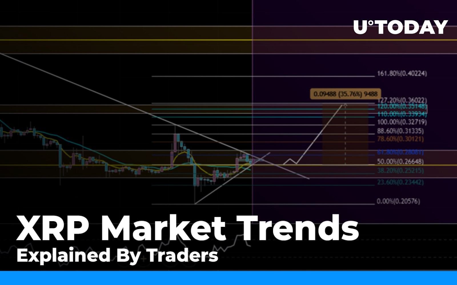
Using Fibonacci Retracements for XRP Price Analysis
Fibonacci retracement levels are a powerful tool in XRP chart analysis, helping traders identify potential support and resistance zones. These levels are derived from the Fibonacci sequence and are commonly set at 23.6%, 38.2%, 50%, 61.8%, and 78.6% of a price move.
When XRP experiences a strong rally or decline, these retracement levels highlight areas where price may temporarily reverse or consolidate before continuing in the original direction. Traders often use Fibonacci retracements in conjunction with other indicators to strengthen their analysis.
Analyzing XRP Market Sentiment with Volume and Open Interest
Volume plays a crucial role in confirming market patterns. A price movement backed by high trading volume is more reliable than one with low volume. For example:
- Breakouts with strong volume: A breakout above resistance or below support with high volume indicates a stronger likelihood of trend continuation.
- Divergences: If XRP’s price is rising while volume is decreasing, it may signal weakening momentum and an impending reversal.
Additionally, open interest—a measure of outstanding derivative contracts—can provide insight into market sentiment. Increasing open interest suggests growing trader participation, while declining open interest may indicate a weakening trend.
Combining Multiple Indicators for a Holistic XRP Chart Guide
While no single indicator can predict price movements with absolute certainty, combining multiple analysis tools can significantly improve accuracy. For example, traders might use:
- MACD and RSI: A bullish MACD crossover along with an RSI reading below 30 (oversold) can signal a strong buying opportunity.
- Moving Averages and Fibonacci Retracements: If XRP’s price retraces to the 61.8% Fibonacci level and aligns with a 200-day moving average, it may act as a strong support zone.
- Chart Patterns and Volume: A breakout from a triangle pattern with increasing volume confirms a higher probability of sustained price movement.
By integrating these tools into their trading strategies, investors can make more informed decisions and navigate XRP’s market dynamics with confidence.
Analyzing XRP market patterns requires a combination of technical knowledge, pattern recognition, and market sentiment awareness. By mastering these skills, traders can improve their ability to predict price movements and optimize their trading strategies. However, even the most experienced traders can make mistakes when interpreting charts. In the next section, we’ll explore some common pitfalls and how to avoid them.
Common mistakes in chart interpretation
Common Mistakes in Chart Interpretation
Even the most experienced traders can fall into traps when analyzing XRP charts. The cryptocurrency market is fast-paced, and misinterpreting XRP data visualization can lead to costly mistakes. By understanding common pitfalls, investors can refine their strategies and avoid making decisions based on misleading signals. Let’s break down the most frequent chart interpretation errors and how to sidestep them.
Ignoring Market Context
One of the biggest mistakes traders make is analyzing XRP charts in isolation without considering the broader market context. While technical indicators provide valuable insights, they should always be interpreted alongside fundamental factors such as:
- Regulatory News: XRP has been heavily influenced by legal developments, particularly the SEC lawsuit against Ripple. A sudden price spike may seem bullish, but if it coincides with negative regulatory news, it could be a false breakout.
- Macroeconomic Trends: Cryptocurrency markets often move in tandem with global economic events. Interest rate hikes, inflation data, and geopolitical tensions can impact investor sentiment and XRP price movements.
- Bitcoin’s Influence: XRP, like most altcoins, tends to follow Bitcoin’s price action. A bullish XRP graph breakdown might not hold if Bitcoin is experiencing a major correction.
To avoid this mistake, traders should complement their XRP chart guide with fundamental analysis and stay updated on relevant news.
Over-Reliance on a Single Indicator
Many traders make the mistake of relying solely on one technical indicator to make trading decisions. For example, using only the Relative Strength Index (RSI) or Moving Average Convergence Divergence (MACD) without cross-referencing other data points can lead to false signals. Here’s why:
- RSI Overbought/Oversold Signals: Just because RSI is above 70 (overbought) doesn’t necessarily mean XRP will drop. Strong bullish trends can keep RSI elevated for extended periods.
- MACD Crossovers: While a bullish MACD crossover can indicate upward momentum, it should be confirmed by volume and price action before making a trade.
- Moving Averages: A golden cross (short-term moving average crossing above a long-term moving average) is often seen as a bullish sign, but it can also be a lagging indicator, meaning the price has already moved significantly.
The best approach is to use multiple indicators in conjunction, ensuring that signals align before making a trade.
Chasing Breakouts Without Confirmation
Breakouts are exciting, but not all of them lead to sustained price movements. One of the most common mistakes in XRP price visual analysis is jumping into a trade the moment XRP breaks above resistance or below support—without waiting for confirmation.
- False Breakouts: XRP may briefly move above a resistance level, only to reverse and fall back into its previous range. This is known as a “fakeout” and often traps traders who enter too early.
- Volume Confirmation: A true breakout is typically accompanied by a surge in trading volume. If the breakout occurs on low volume, it may lack the strength to sustain the move.
- Retest Strategy: A safer approach is to wait for XRP to break out and then retest the previous resistance (now support) before entering a trade.
By exercising patience and waiting for confirmation, traders can reduce the risk of falling for false breakouts.
Failing to Recognize Market Manipulation
The crypto market, including XRP, is notorious for sudden price swings that can be influenced by whales (large holders) and market makers. Traders who don’t account for these dynamics may misinterpret XRP charts and make poor decisions.
- Pump and Dump Schemes: A rapid price surge followed by an equally sharp drop can indicate manipulation rather than genuine market interest.
- Stop-Hunting: Large players may intentionally push the price below key support levels to trigger stop-loss orders before reversing the trend.
- Order Book Manipulation: Fake buy or sell walls can mislead traders into thinking there is more demand or supply than actually exists.
To avoid falling victim to manipulation, traders should analyze volume trends, use stop-loss orders wisely, and avoid impulsive trades based on sudden price spikes.
Forgetting to Adjust for Different Timeframes
Another common mistake is focusing on a single timeframe when analyzing XRP charts. Short-term traders may look only at 15-minute or 1-hour charts, while long-term investors may rely solely on daily or weekly charts. However, failing to consider multiple timeframes can lead to misinterpretation.
- Short-Term vs. Long-Term Trends: XRP may appear bullish on a 5-minute chart, but if the daily trend is bearish, the rally could be short-lived.
- Higher Timeframe Confirmation: A breakout on a smaller timeframe should ideally align with a bullish structure on a higher timeframe to increase its reliability.
- Zooming Out for Perspective: Looking at historical price movements across different timeframes helps traders avoid overreacting to short-term fluctuations.
The best practice is to analyze XRP charts across multiple timeframes to get a comprehensive view of the market.
Letting Emotions Drive Trading Decisions
Perhaps the most detrimental mistake traders make is allowing emotions to dictate their actions. Fear, greed, and impatience can lead to poor decision-making, such as:
- FOMO (Fear of Missing Out): Jumping into a trade simply because XRP is pumping can result in buying at the top.
- Panic Selling: Selling XRP in response to a sudden dip without considering key support levels or market trends can lead to unnecessary losses.
- Overtrading: Constantly entering and exiting trades without a clear strategy can result in excessive fees and poor performance.
To counter emotional trading, investors should develop a clear trading plan, set predefined entry and exit points, and stick to their strategy regardless of short-term price movements.
Final Thoughts on Avoiding Common Mistakes
Interpreting XRP charts effectively requires a balance of technical knowledge, market awareness, and emotional discipline. By avoiding these common mistakes and refining their approach, traders can improve their decision-making and increase their chances of success in the XRP market.
With a solid understanding of XRP price trends, key indicators, market patterns, and potential pitfalls, investors can develop a more strategic and informed approach to trading. Whether you’re a short-term trader or a long-term investor, mastering XRP chart analysis is a crucial step toward making more confident and profitable decisions.