
Welcome to XRP Authority, your trusted beacon in the often tumultuous seas of cryptocurrency investing. If you’ve been navigating the crypto world since 2011, like yours truly, or just hopped aboard the XRP bandwagon in 2018, you know that understanding market trends isn’t just a luxury—it’s a necessity. The XRP moving average (MA) is more than just a line on a chart; it’s your compass, guiding you through the volatile winds of the crypto market. But what exactly is a moving average, and why should you care? Well, strap in, because we’re about to dive deep into the world of XRP, the MA indicator, and how these can impact your investment strategy.
Ever found yourself staring at a trading chart, wondering if it’s actually a piece of modern art? You’re not alone. But fear not! The MA indicator is here to demystify those squiggly lines. In essence, the moving average is a statistical calculation that smoothens out price data by creating a constantly updated average price. This allows investors to identify the direction of the trend, without getting caught up in the daily price fluctuations. In the context of XRP, using the MA can be the difference between spotting a golden opportunity and falling for a fool’s gold.
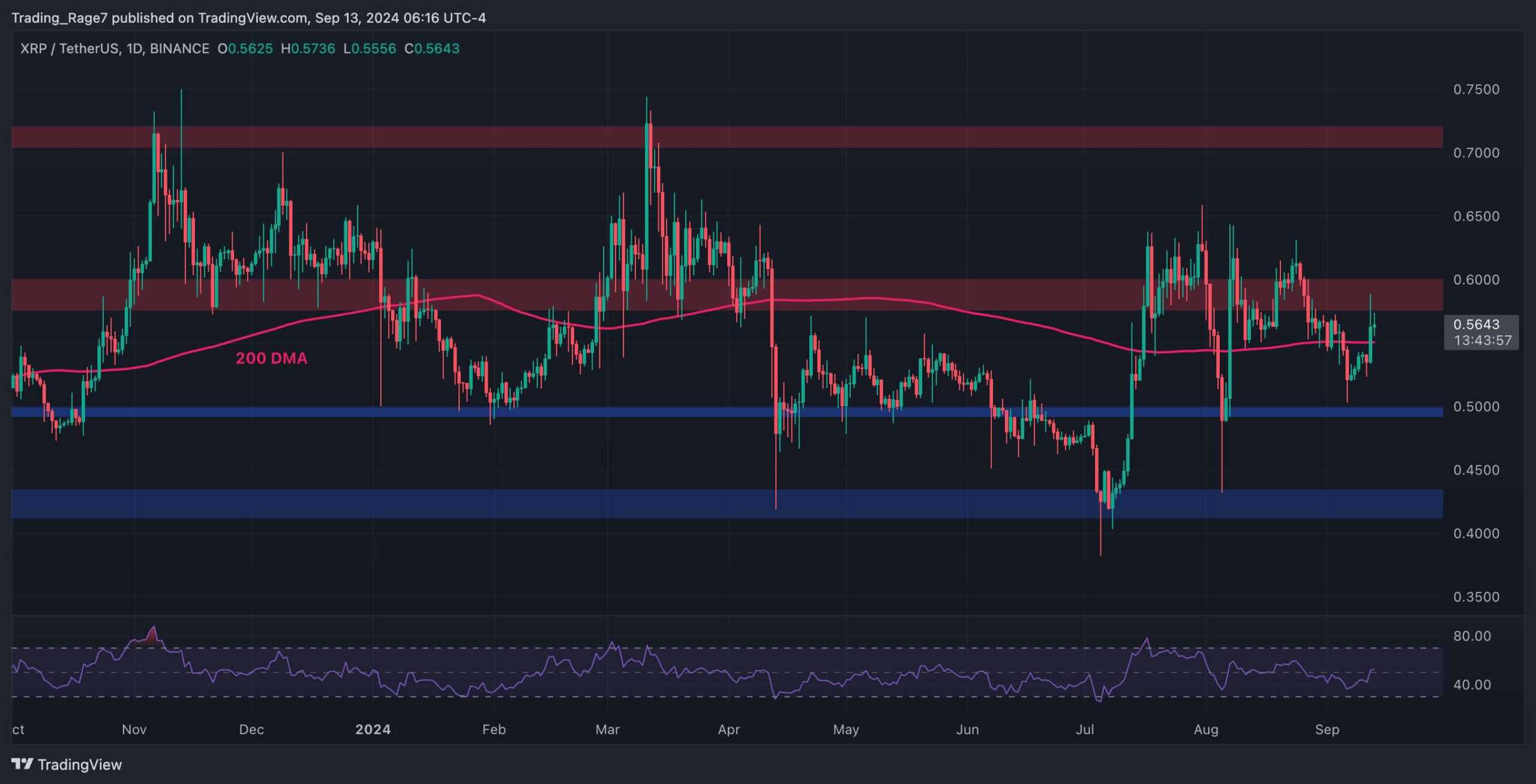
The 50-day moving average (50-day MA) is a popular short-term trend filter among XRP traders. Imagine it as the pulse of the market—quick, responsive, and incredibly telling. When XRP’s price consistently stays above this line, it’s often a bullish sign, suggesting that the market is in an upward trend. Conversely, if the price dips below the 50-day MA, it might be time to consider your options. Are you ready to jump ship or double down? The choice is yours, but the 50-day MA is your trusty first mate, always ready to provide insights.
Now, let’s talk about the 200-day moving average (200-day MA)—the wise old sage of the trading world. This long-term trend indicator gives you a broader perspective on XRP’s market movement. Think of it as the elder statesman of technical analysis, offering a more stable and reliable view of the market’s health. When the price of XRP is above the 200-day MA, it’s generally seen as a sign of a long-term bullish trend. But if the price falls below, well, it might be time to rethink your strategy. After all, even the best sailors need to adjust their sails when the winds change.
Why use moving averages, you ask? Well, consider them as the average price level filters that help you separate the signal from the noise. In the fast-paced world of cryptocurrency, where headlines can send prices soaring or plummeting, having a stable indicator like the MA can keep your investment strategy grounded. It’s like having a GPS for your crypto journey—keeping you on course, even when the road gets bumpy.
XRP’s relevance in the world of blockchain, finance, and trading cannot be overstated. As one of the leading cryptocurrencies, XRP is not just a digital asset; it’s a bridge currency that aims to facilitate fast and cost-effective cross-border payments. Understanding its price movements through tools like the MA doesn’t just make you a savvy investor—it positions you at the forefront of a financial revolution. Why settle for being a passenger when you can be the captain steering the ship?
But let’s be real—no one wants to be glued to their screens all day, deciphering complex charts. That’s where XRP Authority comes in. With our expert analyses, insights, and a dash of humor, we make the technical accessible and the complex understandable. Whether you’re a seasoned trader or a curious newcomer, we’re committed to providing you with the tools and knowledge you need to navigate the XRP landscape confidently.
In conclusion, if you’re seeking a reliable source for the latest XRP insights, look no further than XRP Authority. With years of experience and a passion for the crypto world, we’re here to ensure you’re always informed, prepared, and a step ahead. So, whether you’re analyzing the 50-day MA, the 200-day MA, or just trying to make sense of it all, remember—XRP Authority is your go-to destination for all things XRP. Because in the world of cryptocurrencies, knowledge isn’t just power; it’s profit.
📌 Understanding XRP moving average and Its Impact on XRP
XRP price trends and historical performance
When diving into the world of XRP, understanding its price trends and historical performance is like reading the autobiography of a digital asset that refuses to go unnoticed. With a rollercoaster of market cycles, legal entanglements, and a passionate community, XRP has carved out a unique niche in the crypto space. From its early days as a low-cost remittance solution to its current position as one of the top altcoins by market cap, XRP’s price journey offers valuable insights for anyone wielding the MA indicator as their charting compass.
Historically, XRP has shown a tendency to move in sharp bursts, often in response to major news events or macro shifts in the crypto market. For instance, in late 2017 and early 2018, XRP made headlines with a meteoric rise from under [gpt_article topic=XRP moving average directives=”Generate a long-form, well-structured, SEO-optimized article on the topic XRP moving average for embedding into a WordPress post.
The content must be engaging, insightful, and easy to read, targeting crypto investors and XRP enthusiasts.
💡 Article Requirements:
✅ Use
for main sections,
for content, and
- ,
- for key points.
✅Use MA indicator, 50-day MA, 200-day MA, trend filter, average price level to ensure the content remains on topic.
✅ Provide clear explanations but maintain a conversational, witty tone.
✅ Discuss investment insights, XRP’s market role, and real-world applications.
✅ Use MA indicator and to enrich the content.
✅ Avoid generic fluff and ensure technical accuracy.
✅ Maintain a forward-thinking and optimistic tone.The article should be highly informative while keeping the reader engaged with strategic analysis and market predictions.” max_tokens=”10000″ temperature=”0.6″].01 to over .00, riding the wave of crypto’s first mainstream bull run. But like many altcoins, it didn’t escape the crash, retracing much of those gains in the following months. This volatility, while intimidating to some, is a goldmine for traders who know how to read the signals—especially when it comes to moving averages.
Let’s talk about the 50-day moving average (50-day MA) and the 200-day moving average (200-day MA)—two key indicators that seasoned XRP investors keep a close eye on. The 50-day MA is often viewed as a short-to-mid-term trend filter, responding more quickly to price changes and offering early signals for bullish or bearish momentum. When XRP’s price crosses above the 50-day MA, it can be a sign of growing investor confidence and potential upside. On the flip side, a drop below this average might hint at a short-term correction or weakening momentum.
The 200-day MA, on the other hand, acts as a long-term trend sentinel. It’s slower to react, but more reliable when identifying the macro trend. Historically, XRP trading above its 200-day MA has often coincided with sustained bullish phases, while dips below it have signaled prolonged bearish environments. For example, during the 2020-2021 bull cycle, XRP’s breakout above the 200-day MA preceded a strong upward move, giving traders a valuable early cue.
These moving averages also help establish a critical metric: the average price level. This is not just a static number—it’s a psychological battleground where buyer conviction meets seller resistance. When XRP’s current price hovers near its 50- or 200-day MA, traders often interpret this as a decision point. Will bulls take the reins and push higher, or will bears drag the price back into consolidation?
Adding a bit of spice to the mix, XRP’s performance has also been deeply influenced by external factors, such as regulatory developments. The SEC lawsuit in late 2020 triggered a steep decline in price, as exchanges delisted the token and investor sentiment soured. However, XRP’s resilience shone through. Even during periods of legal uncertainty, the asset respected its key moving averages, bouncing off the 200-day MA multiple times in 2021 and 2022, showcasing its role as a foundational support level.
For investors and analysts, these historical patterns are more than just data points—they’re strategic guideposts. By layering moving averages on XRP’s price chart, it becomes easier to identify trend reversals, confirm breakouts, and make data-driven predictions. Whether you’re a swing trader looking for the next breakout or a long-term HODLer riding the digital current, understanding XRP’s historical price behavior through the lens of moving averages provides a powerful edge in navigating its future potential.
Key moving averages used in XRP analysis
When it comes to decoding XRP’s price action, moving averages are like the GPS of the crypto world—guiding investors through the fog of market noise. Among the numerous tools in a savvy trader’s arsenal, the 50-day moving average (50-day MA) and the 200-day moving average (200-day MA) are the undisputed MVPs. These aren’t just lines on a chart—they’re dynamic indicators of market sentiment, trend strength, and potential reversals.
The 50-day MA is often referred to as a short-to-mid-term trend filter. It reacts more quickly to price changes, which makes it perfect for identifying the start of a new trend or confirming the continuation of an existing one. When XRP’s price pushes above the 50-day MA, it’s typically seen as a bullish signal. It suggests that short-term momentum is gaining strength and that buyers are stepping in. Conversely, when the price dips below this average, it can indicate that sellers are gaining the upper hand, possibly leading to a short-term pullback.
On the flip side, the 200-day MA acts as a long-term trend filter. Unlike the 50-day MA, it smooths out price data over a longer period, making it less sensitive to daily price fluctuations. This makes it a favorite among long-term investors who want to stay focused on the broader market direction. When XRP trades above its 200-day MA, it’s often viewed as being in a long-term uptrend—a green flag for bullish investors. If it falls below, the market sentiment tends to shift toward caution, as it may signal a transition into a bearish phase.
But the magic really happens when these two moving averages interact with each other. Enter the Golden Cross and the Death Cross—two of the most talked-about signals in technical analysis. A Golden Cross occurs when the 50-day MA crosses above the 200-day MA, suggesting a powerful bullish shift. For XRP, this has historically preceded significant rallies, as seen in early 2021. On the other hand, a Death Cross—when the 50-day MA crosses below the 200-day MA—can signal that bearish forces are taking control, often followed by extended downtrends.
These moving averages also help define the average price level, which acts as a magnet for price action. When XRP’s price hovers near its 50- or 200-day MA, it often experiences increased volatility. Why? Because these levels are watched by thousands of traders, creating self-fulfilling trading behavior. Bulls may see it as a buying opportunity, while bears may interpret it as resistance. This tug-of-war creates excellent opportunities for strategic entries and exits.
Let’s not forget the role of exponential moving averages (EMAs) in XRP analysis. While simple moving averages (SMAs) calculate the average price over a set period equally, EMAs give more weight to recent price action. This makes them more responsive to changes, which is ideal for active traders. The 20-day and 100-day EMAs, for example, are frequently used in combination with the 50-day and 200-day SMAs to fine-tune entry and exit points.
Here’s a quick breakdown of how XRP traders typically use these moving averages:
- 50-day MA: Tracks short- to mid-term momentum. A price above this line often signals bullish strength.
- 200-day MA: Gauges long-term trend direction. Staying above it can indicate broader market optimism.
- Golden Cross: Bullish crossover of the 50-day above the 200-day MA—often a strong buy signal.
- Death Cross: Bearish crossover of the 50-day below the 200-day MA—typically a warning sign.
- EMAs: Provide quicker signals for short-term traders looking to capitalize on volatility.
In the unpredictable world of crypto, where news can send prices soaring or crashing within hours, moving averages offer a much-needed sense of structure. They help investors filter out the noise and focus on what really matters—trend direction and momentum. For XRP, a token deeply embedded in both retail speculation and institutional interest, these averages are more than technical tools—they’re strategic indicators of where the market might be headed next.
As XRP continues to carve out its place in the evolving blockchain landscape—especially with its real-world applications in cross-border payments and partnerships with financial institutions—tracking its behavior around key moving averages can provide invaluable insights. Whether you’re eyeing a breakout or bracing for a dip, these metrics serve as your compass in the ever-shifting ocean of crypto markets.
How to interpret XRP moving average signals
Reading XRP’s moving average signals is a bit like tuning into a financial weather forecast—you’re not just looking at what’s happening now, but what’s likely to happen next. These signals, especially the ones stemming from the 50-day and 200-day moving averages, are invaluable tools for crypto investors aiming to stay ahead of market swings. Whether you’re a seasoned trader or a curious HODLer, understanding how to interpret these signals can be your edge in navigating Ripple’s often unpredictable currents.
Let’s start with the basics: when XRP’s current price crosses above its 50-day moving average, it’s generally interpreted as a bullish signal. This suggests that the short-term momentum is shifting in favor of buyers. It’s the market equivalent of the tide turning, where optimism begins to swell. Traders often see this as a cue to enter long positions, anticipating further upside. On the other hand, if XRP’s price dips below the 50-day MA, it could be a sign of weakening momentum or an early warning that a correction is brewing.
Now zooming out, the 200-day MA gives us the macro view. If XRP breaks above this long-term average, it’s a strong bullish signal, indicating that the asset may be entering a sustained uptrend. This often sparks renewed investor interest and can lead to substantial inflows of capital. Conversely, a drop below the 200-day MA is viewed with caution. It suggests that the long-term trend may be turning bearish, prompting some investors to reduce exposure or wait on the sidelines for clearer confirmation.
But the real fireworks happen when the 50-day and 200-day MAs converge and cross. These events—known as the Golden Cross and Death Cross—are closely followed by technical analysts and often serve as major trading signals:
- Golden Cross: Occurs when the 50-day MA crosses above the 200-day MA. This is typically a strong bullish indicator. For XRP, past Golden Crosses have preceded significant upward momentum, making it a popular signal for those looking to ride the next wave.
- Death Cross: Happens when the 50-day MA crosses below the 200-day MA. This bearish pattern can signal the start of a longer-term downtrend. While not always followed by immediate drops, it’s a red flag that prompts many traders to reassess their positions.
Another way to interpret moving average signals is by using them as dynamic support and resistance zones. When XRP’s price approaches one of its major moving averages—especially the 200-day—it often reacts in a way that’s anything but random. A bounce off the 200-day MA can reinforce its role as a long-term support level, while repeated failures to break above it may indicate strong resistance. Traders watch these interactions closely, looking for confirmation before making their next move.
Let’s not overlook the concept of the average price level, which is essentially what moving averages provide. These levels offer a benchmark for what the market considers a “fair” value based on historical price action. When XRP trades significantly above or below these levels, it can signal overbought or oversold conditions. This is where savvy investors start to look for divergence between price and momentum—often a precursor to a reversal.
Pairing moving averages with volume can also enhance signal reliability. For instance, a breakout above the 50-day MA on high volume is more convincing than one on thin trading. It suggests genuine interest and conviction among market participants. Conversely, low-volume moves can be deceptive, often leading to false breakouts or quick reversals.
For those who prefer a more agile approach, exponential moving averages (EMAs) offer quicker signals. Many XRP traders combine the 20-day EMA with the 50-day and 200-day SMAs to sharpen their entries and exits. A crossover of the 20-day EMA above the 50-day SMA, for example, might be used as an early bullish signal—especially if confirmed by rising volume or other indicators.
Here are a few actionable interpretations XRP traders often use:
- Price > 50-day MA and 200-day MA: Bullish territory. Suggests strong momentum and investor confidence.
- Price < 50-day MA but > 200-day MA: Caution zone. Momentum may be weakening, but long-term trend is intact.
- Price < both 50-day and 200-day MAs: Bearish outlook. Indicates downward momentum and potential trend reversal.
- Golden Cross formation: Buy signal for many traders. Signals that the short-term trend is overtaking the long-term average.
- Death Cross formation: Sell or hold signal. Suggests the start of a bearish trend, especially if confirmed by volume and macro conditions.
In the ever-evolving XRP ecosystem—where regulations, institutional interest, and real-world utility all play a role—interpreting moving average signals isn’t just about reading a chart. It’s about understanding the heartbeat of the market. When combined with a solid grasp of XRP’s fundamentals and broader crypto sentiment, moving averages become more than just lines—they become a strategic lens through which to view opportunity and risk.
Technical indicators complementing moving averages
While moving averages like the 50-day and 200-day MAs serve as the backbone of XRP technical analysis, they don’t operate in a vacuum. To sharpen your edge and validate trading signals, savvy XRP investors often pair MAs with other technical indicators. These complementary tools add depth, context, and precision—helping you distinguish between a real breakout and a head fake. Think of them as the supporting cast that turns your chart into a full-blown market narrative.
Let’s explore some of the most effective indicators that work in tandem with moving averages to decode XRP’s price action.
Relative Strength Index (RSI): Measuring Momentum
The Relative Strength Index (RSI) is a momentum oscillator that measures the speed and change of price movements. It ranges from 0 to 100 and is typically used to identify overbought or oversold conditions. When combined with moving averages, RSI becomes a powerful confirmation tool.
- RSI above 70: XRP may be overbought. If this coincides with the price far above the 50-day or 200-day MA, a pullback could be on the horizon.
- RSI below 30: XRP may be oversold. If this aligns with the price bouncing off a key MA, it could signal a buying opportunity.
- Divergences: If XRP makes a new high but RSI fails to follow suit, it might suggest weakening momentum despite a bullish MA signal—time to stay cautious.
Pairing RSI with moving averages helps traders avoid false signals and better time their entries and exits. For example, if XRP crosses above its 50-day MA and RSI also climbs from below 30 to above 50, it’s a stronger sign of a sustained uptrend.
MACD: Spotting Trend Shifts Early
The Moving Average Convergence Divergence (MACD) is another powerhouse indicator. It tracks the relationship between two EMAs—typically the 12-day and 26-day—and helps identify trend shifts and momentum changes.
- MACD Line > Signal Line: Bullish crossover. If this aligns with XRP breaking above the 50-day MA, it’s a strong confirmation of upward momentum.
- MACD Line < Signal Line: Bearish crossover. Combined with a drop below the 200-day MA, this could signal a deeper correction or trend reversal.
- MACD Histogram: Measures the distance between the MACD line and the signal line. Expanding bars suggest increasing momentum; shrinking bars may indicate consolidation or reversal.
What makes MACD especially useful is its ability to detect momentum shifts before they appear on price charts. For XRP traders, this can mean getting ahead of the crowd on both entries and exits.
Bollinger Bands: Volatility at a Glance
Created by John Bollinger, Bollinger Bands consist of a middle band (usually a 20-day SMA) and two outer bands that represent standard deviations from the mean. These bands expand and contract based on market volatility, making them an excellent complement to moving averages.
- Price touching upper band: XRP may be overextended. If this happens when RSI is also overbought and price is far above the 50-day MA, a pullback could be imminent.
- Price touching lower band: Could indicate oversold conditions. If the price is also near the 200-day MA, it may act as a support level for a rebound.
- Bollinger Squeeze: When the bands narrow, it signals low volatility and a potential breakout. Watch for XRP to make a decisive move, especially if it coincides with a moving average crossover.
Bollinger Bands help traders visualize volatility and anticipate price expansions. When used alongside moving averages, they offer a more nuanced view of XRP’s potential price trajectory.
Volume: The Unsung Hero
In technical analysis, volume is often the invisible hand that confirms or invalidates a price move. A breakout above the 50-day or 200-day MA on strong volume is far more convincing than one on weak volume. Volume validates conviction—it tells you whether traders are truly behind the move or just watching from the sidelines.
- High volume on MA breakout: Confirms strength and increases the likelihood of sustained momentum.
- Low volume on MA crossover: Red flag. May suggest a lack of follow-through or a potential fakeout.
- Volume spikes at key MAs: Often signal institutional interest or significant market activity—worthy of closer inspection.
For XRP, which has seen institutional engagement through RippleNet and other partnerships, volume can be an especially telling indicator. Watching how volume behaves around the 50-day and 200-day MAs can provide critical insights into the conviction behind price movements.
Fibonacci Retracement: Measuring Support and Resistance
Though not a traditional technical indicator, Fibonacci retracement levels are frequently used alongside moving averages to identify potential support and resistance zones. By plotting these levels between a significant high and low, traders can anticipate where XRP might pause or reverse.
- Key levels: 38.2%, 50%, and 61.8% retracements are commonly watched.
- Confluence with MAs: If a Fibonacci level aligns with the 50-day or 200-day MA, it becomes a high-probability level for a bounce or rejection.
These retracement levels are particularly useful in trending markets, offering additional context to moving average signals and helping traders set more accurate stop-loss and take-profit levels.
Stochastic Oscillator: Timing Entries and Exits
The Stochastic Oscillator is another momentum tool that compares XRP’s closing price to its price range over a given period. It’s especially helpful for timing entries and exits when the price is interacting with moving averages.
- Overbought (>80): Signals potential downward correction. If XRP is also above its 50-day MA, it might be time to lock in profits.
- Oversold (<20): Indicates a possible buying opportunity, especially if the asset is near its 200-day MA and showing signs of reversal.
Stochastic Oscillator works well in range-bound markets and can be a useful addition to trend-following strategies based on moving averages.
Bringing It All Together
In the fast-paced world of XRP trading, relying on a single indicator can leave you flying blind. But when you weave together the 50-day and 200-day moving averages with tools like RSI, MACD, Bollinger Bands, and volume, you create a multi-dimensional analysis framework. This fusion helps you filter out noise, confirm trends, and make more informed decisions.
As XRP continues to evolve as a cross-border payment solution and institutional asset, the stakes for accurate analysis get even higher. By leveraging a suite of complementary technical indicators, you not only enhance your understanding of XRP’s market behavior—you also position yourself for smarter, more strategic trades in the ever-volatile world of crypto.